Creating (categorical) heatmaps with matplotlib consists of 2 steps: painting cells with colors and annotating it.
Packages
The package in need is mainly matplotlib.
1 | |
Using numpy or pandas would also make things easier.
Painting cells
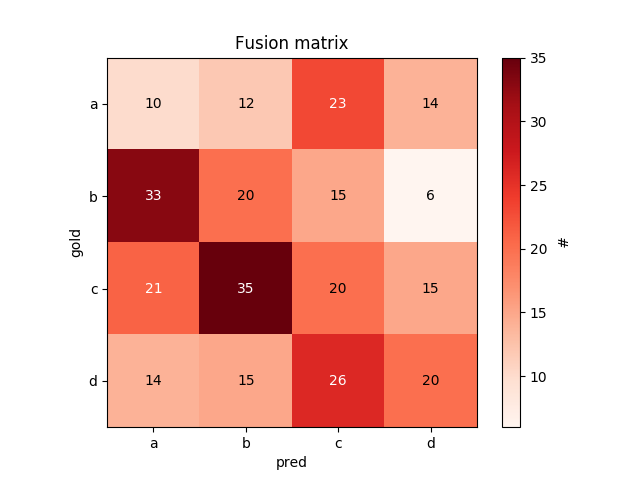
Assuming we already have an numpy array named fusMat (i.e. a fusion matrix). The name of columns (as well as rows) in a list is classes. To paint the cells, do this
1 | |
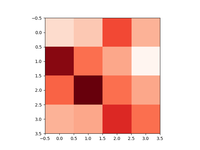
and we will get something like:
 To change the coloring scheme, use parameter
 cmap in .imshow() method:
1 | |
Annotating
Clearly the axises in the figure above is not what we want. So we need to change these “tick labels”:
1 | |
We would also like to specify what x- and y-axis stands for:
1 | |
A color bar would be nice:
1 | |
We want the numbers of each cell be displayed, in white on dark cells, and black on light cells:
1 | |
To add title, use
1 | |
Finally, we get somthing like this:
Saving to file
To save the fig to a file:
1 | |